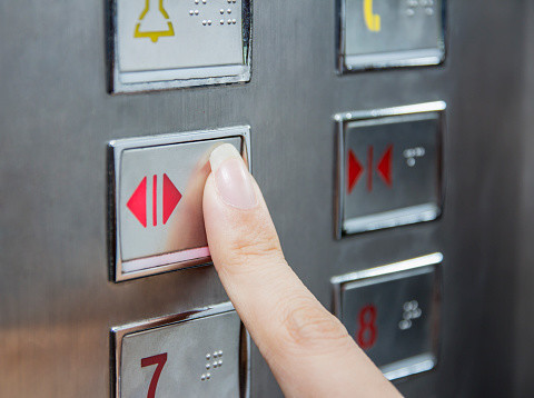
So then, the arrows are the direction in which the doors move. It, then, follows that the negative space on either side of the thin line are the doors themselves. It cannot be the doors because there are two of them and only one line, so it must be the gap. At first, it may seem like that line surrounded by the triangles is meant to represent the doors, but further analysis suggests that it is the gap between the doors. We’ll turn our attention first to the “DOOR OPEN” button, as it’s labeled in the above image.

To save the reader the time of driving down to the nearest hotel, I have provided a free image that I myself found on the internet for reference:

The first step to understanding an image is to look at it. In order to understand these buttons, taking another step toward omniscience, I will dissect the design of the buttons. How can two buttons with completely opposite functions be so similar? They comprise of a line surrounded by two menacing triangles, and therein lies the problem - the two buttons are the same, save for the orientation of the triangles. These are buttons to open and close the elevator doors. However, I have neglected to mention two buttons for both dramatic effect and to end the last sentence with the joke about the keyhole. There are distinct buttons for each floor, a button to call the firefighters, and a keyhole, which I guess might be for the firefighters to turn on sprinklers (this feature shouldn’t be locked, so that the public may deal with elevator fires themselves). The buttons on an elevator are standard and usually have the same font, color scheme, and designs. No other machines have both buttons on the inside and the outside.

There are buttons on both the inside and the outside of an elevator - a feature exclusive to elevators. They have many buttons in fact, buttons are probably the primary feature of an elevator, outside of its vertical movement and passenger-carrying features.


 0 kommentar(er)
